

Collaborated with Andrew Bailes, Amanda Culver, And Suzanne Gonzalez
Story
As the 11th largest classical ballet company in the Country,Ballet Austin, with five decades of of dance history , is looking to change the way they are perceived within the dance community. With the desire to promote evolving ideas, Ballet Austin has welcomed non-traditional style of dance and fitness into their company.
Solution
Disrupting the balance within the world of dance is something that Ballet Austin does every day. A new tagline highlighting that "disrupting the balance" paired with matching ad and social media campaign will revitalize Ballet Austin.
Challenge
Re-brand Ballet Austin with a focused message that improves communication within the company and the Austin Community. Create a brand idenity that engages its audience and communicates progressive dance.
Logo Inspiration
Inspiration for the Ballet Austin logo was drawn from the corner angle of Ballet Austin's unique architecture. By simplifying the buildings into four dynamic shapes, a logo emerged creating motion and movement in the mark.The four shapes are also used to represent the four categories within Ballet Austin: The Academy, Dance and Fitness,The community, and Ballet Austin 2.


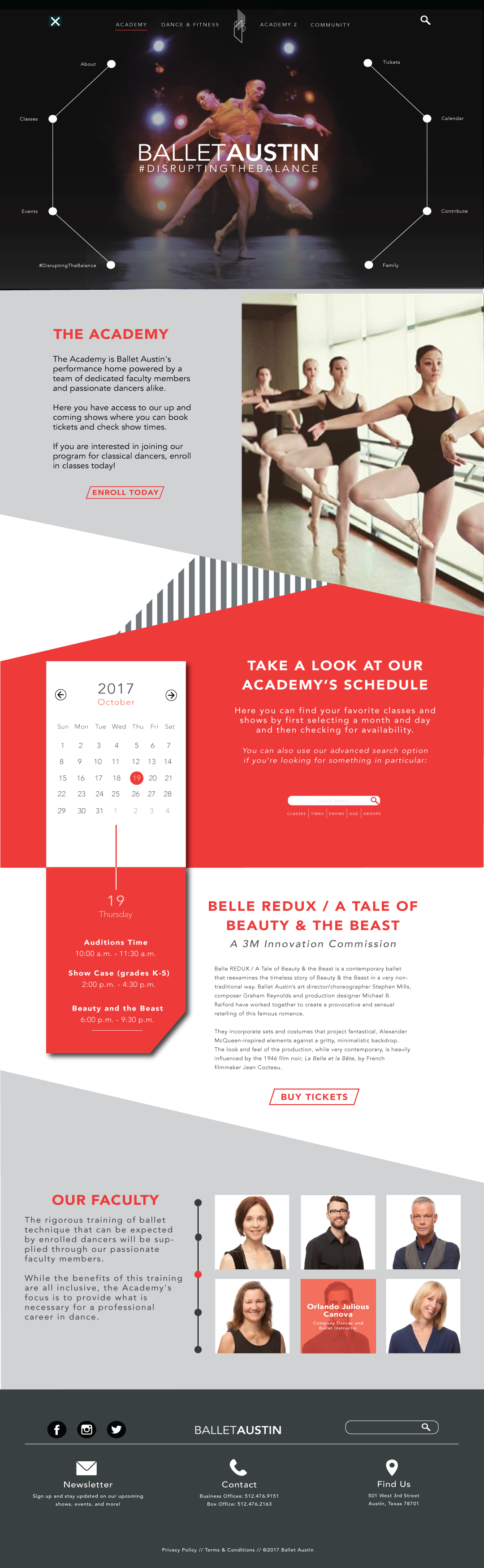
Web
The original website of ballet Austin was too Cluttered and had a confusing navigation.By Using two navigations, one for the main divisions of Ballet Austin and another for the secondary information, make for a much easier navigation of the website.

Mobile Web


Print Ads


Photography Credit: Michael Thad Carter
Poster Design: Andrew Bailes